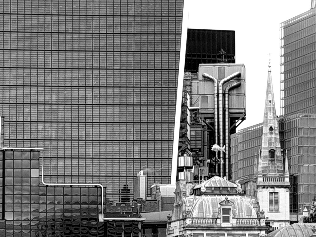
Looking north across the river Thames towards the heart of the City as it has now become, I thought this curious mash-up of architectural ideas (see below) gives some sense of what a total mess it has now become. To the right is the church tower of St. Margaret Pattens in Eastcheap, designed by Wren and which survived the Second World War. In front, you have one of the corner towers of Old Billingsgate market, proudly civic, designed by Horace Jones, architect to the City and designer of Tower Bridge. Behind it, you have Lloyd’s, designed by Richard Rogers in an idiom which was a deliberate contrast to everything around it, exciting at the time, but in retrospect, introducing an idea that anything goes. Then everything is dominated, indeed totally overwhelmed, by the bulk of the Walkie-Talkie, designed by Rafael Viñoly.
The question I ask myself is: are we expected to feel pleased and proud that our generation have so destroyed the City and produced a form of urban pandemonium. And whose idea was it ? Was it intended or just a result of market forces ? Was the City’s planning department asleep at the wheel or did they want this to happen ? Answers and suggestions would be much appreciated:-

Peter Rees when the City’s chief planner was very enthusiastic about the central ‘cluster’ of towers. He even praised the walkie talkie, describing as something equivalent to the prow of a ship. I think got the walkie talkie badly wrong and pretty much everyone agrees it’s too bulky. I’ve even heard Vinoly disown it, saying the developer should be sued, which is odd as it can’t have changed that much from his design. My sense is that until the walkie talkie Rees had it reasonably under control, with some good points, but now it’s feels like the Wild West. Presumably City property values are dropping fast; I wonder what will happen next.
Dear Maurice, Thank you. I knew Peter Rees had been key. I don’t like the Walkie Talkie, which is too big and too crude – and then everything else looks like an attempt to prevent it being so dominant. I’m not anti- the Dubai look, but prefer it in Dubai. Charles