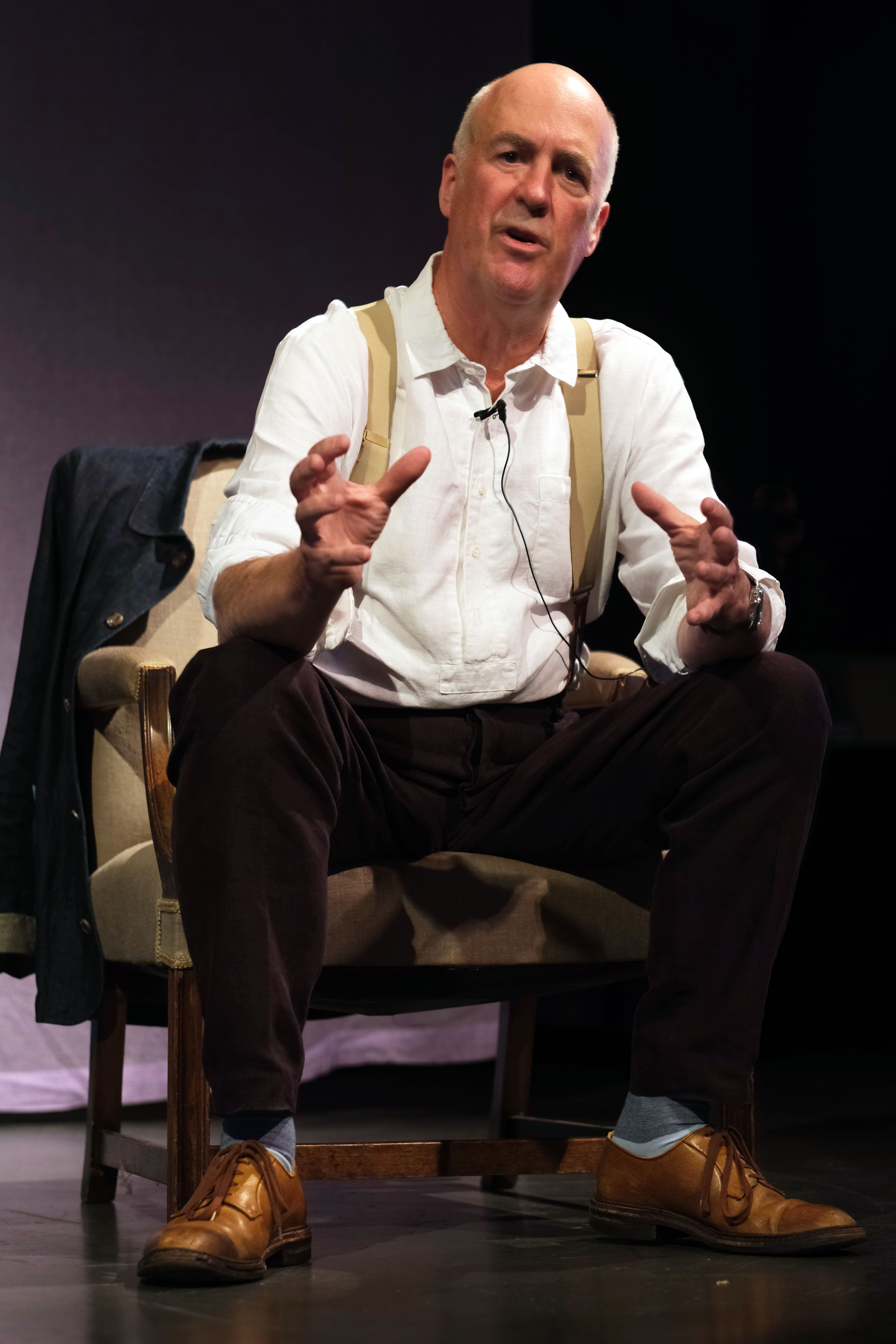

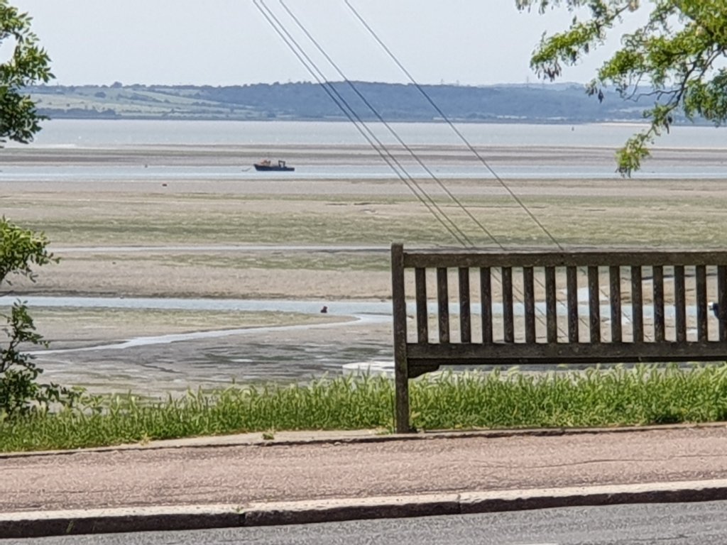
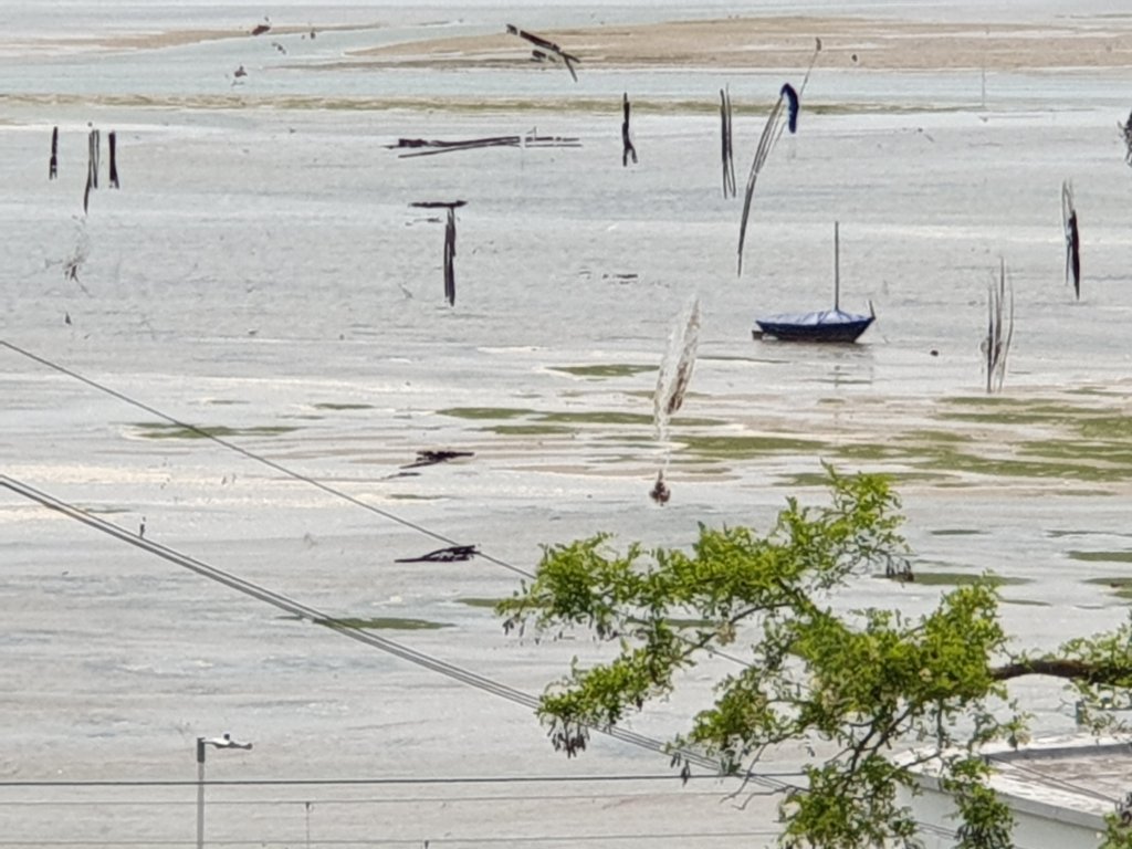
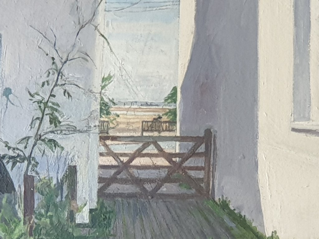
I went on the train from Limehouse to Chalkwell to see John Wonnacott’s latest work which was all lined up in his back yard:-
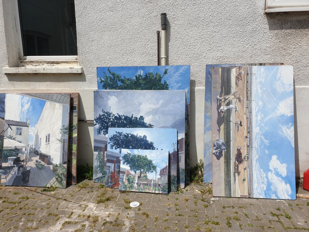
I enjoyed seeing it, particularly a small painting inspired by Giovanni Bellini:-

He is good at painting movement. And flowers, which I don’t associate with him:-
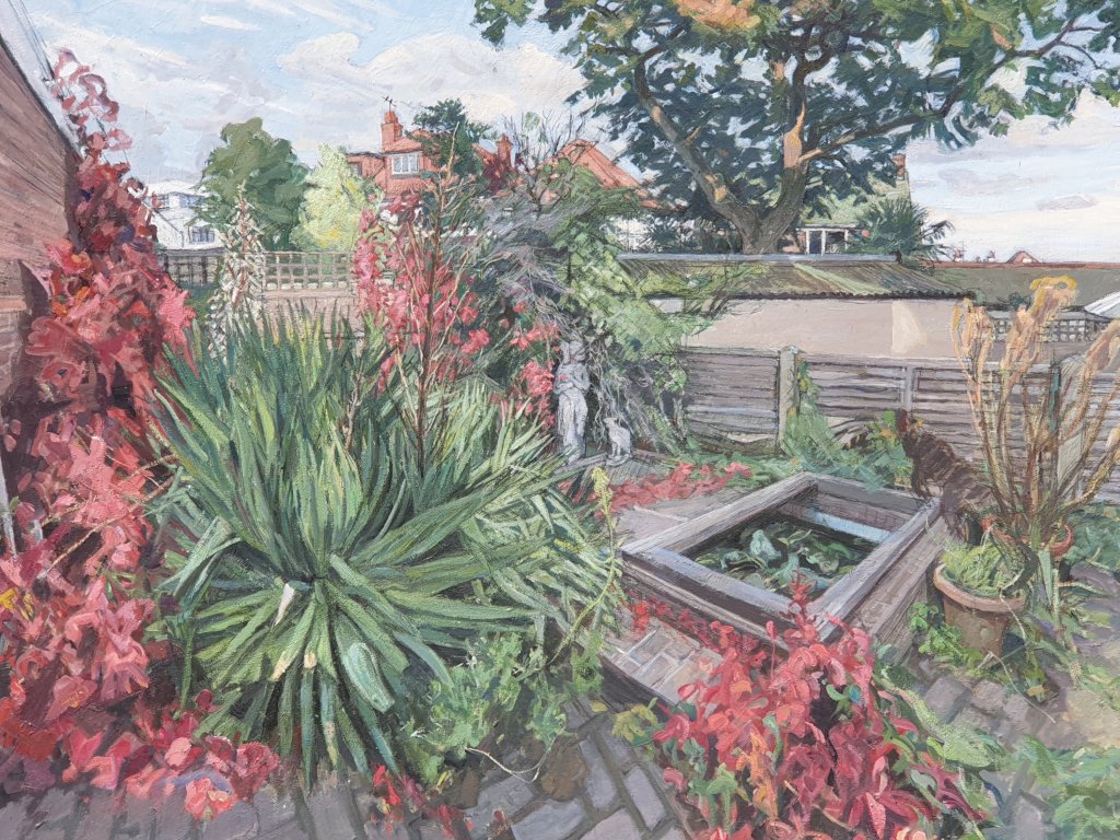
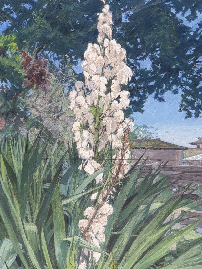
Since it is nearly the anniversary of the Grenfell Tower fire, I am also posting his fine commemorative painting post-fire:-

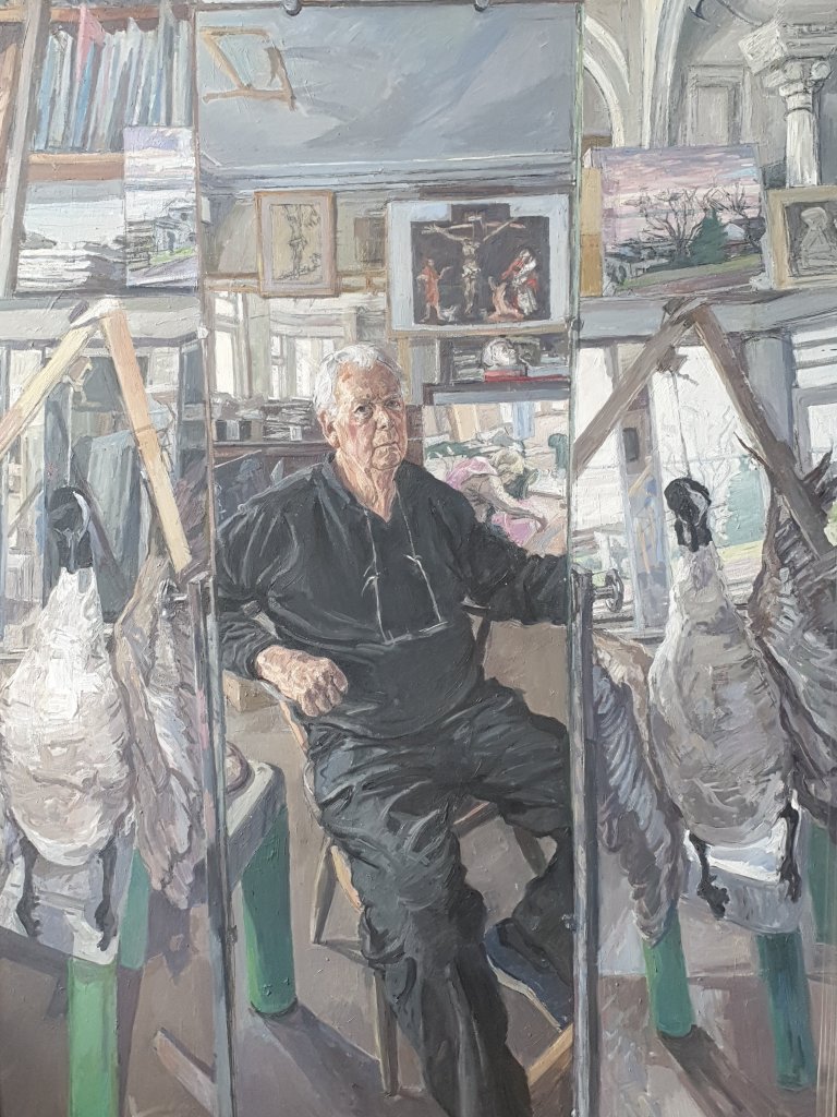
And a recent Self-Portrait:-
As readers of my blog will know, I am mildly obsessed by good bread and where to buy it, partly a consequence of lockdown, which I think has made everyone focus on quality of food while restaurants have been closed and partly because I have always liked good fresh bread, almost better than anything (we had to fight for a loaf of fresh bread after lunch at school). So, I was pleased to get the latest issue of The Modern House Journal, which clearly shares this obsession (Bread Winner: London’s best bakeries | Journal | The Modern House). But it is not very strong on East London and misses out Breid, which supplies lots of local shops, and has become more and more popular over the last year, and my new favourite, Doh in Hackney Wick. They both deserve to be part of the pantheon.
A robin has made its nest in the ceramic fish hanging under the verandah in the garden:-
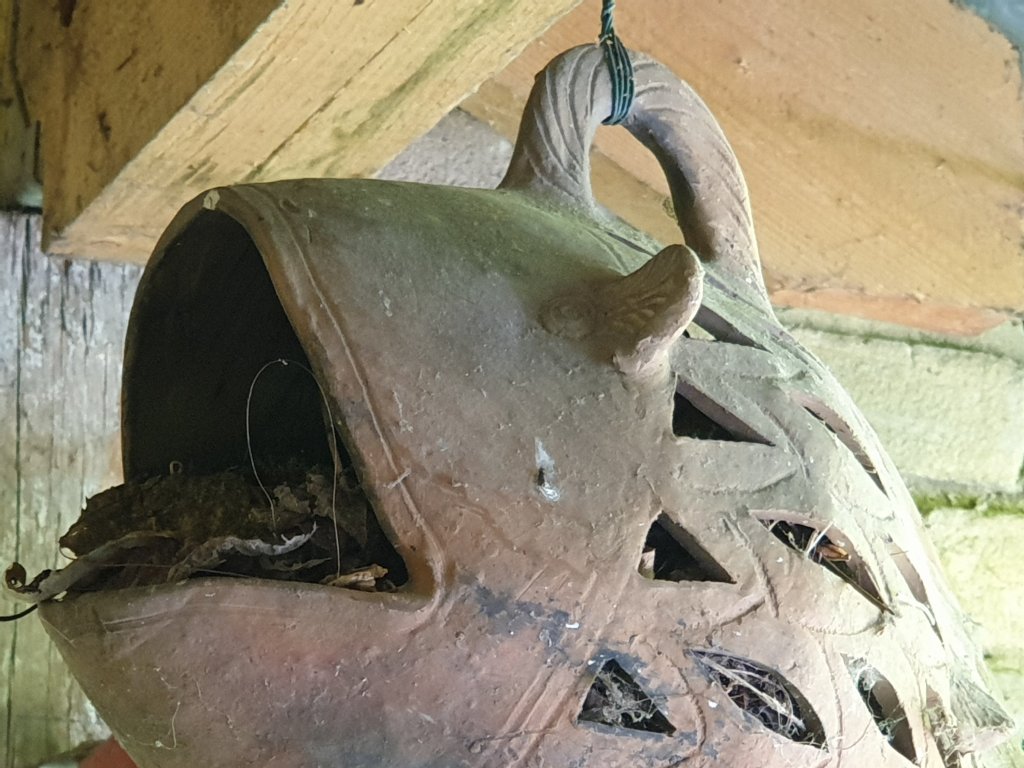
Today at lunchtime, its progeny was hopping about the garden – larger and fluffier than its parent:-

We went to Thomas Adès’s 50th. birthday concert at the Barbican, starting and ending with Beethoven, with two great works by Sibelius and Janáček and two by Adès himself, one a new work based on a sea shanty and one an older work written when he was twenty-six, described by the chief violinist of the Britten Sinfonia as both disciplined and bonkers. It made me look up the picture which the NPG commissioned, when he was only thirty one, the first of a series of portraits paid for by the Jerwood Foundation to show young talent. It was rather a brilliant portrait, showing him in a buttoned-up white cotton suit, twisted up on an old leather chair with an empty wine glass by his feet. Of course, the hall was half empty because of the requirement for social distancing, but this didn’t diminish the intensity of the occasion and the sense of normal life beginning to resume, like sleepwalkers after a long intermission.
I am very honoured to have been sent a characteristically thoughtful review of my book by Svetlana Alpers, the great historian of Dutch painting, formerly of Berkeley, California, now writing about photography in New York. Of course, she is right that much is missing from the book by focusing only on the last eighty years or so, thereby missing out on the pleasures of the Grand Old Men of the international museums, including the National Gallery which she remembers, as do I, when it was a straight historical circuit, starting to the left of the entrance staircase. And I don’t dispute that it is important to encourage critical historical attention as well as more casual wandering. It will probably be seen correctly as a pre-COVID text when the mood was more optimistic. Let’s hope that some of the angst now surrounding museums dissipates, and we can recover a better sense of their role in fostering an interest in other cultures.
https://www.keyreporter.org/book-reviews/2021/the-art-museum-in-modern-times/
A couple of footnotes to the discussion on typography and museums.
Way back in early February, I was interviewed by Jesse Dylan and Priscilla Cohen who have a company in Los Angeles doing podcasts called Wondros. I had pretty much forgotten about it and what I might have said, but it has just gone live on YouTube (link as below) in which I am asked a series of interesting and intellectually challenging – and frequently unexpected – questions including ‘How easy is it to photograph snow ?’ It was at the beginning of what has been an intellectual journey for me over the last four months discussing the future of museums.
We had an interesting discussion last night with the MCICH Network of the Royal Society of Arts about the role that graphic design plays in the construction of a museum’s graphic identity, pioneered, as in so much else by Alfred Barr at the Museum of Modern Art, who included graphic arts in the course he taught at Wellesley in 1926-7 and paid close attention to the design and production of all the museum’s publications. My book is set in Futura, a sans serif typeface designed by Paul Renner some time between 1924 and 1927 when he was director of the Frankfurter Kunstschule typography department and first issued by the Bauer Type Foundry in 1927 as ‘the typeface of today and tomorrow’. It was the typeface used by the Museum of Modern Art in its series Documents of Modern Art, first issued in 1943. Apparently, ‘Barr’s zealotry was reflected everywhere in the museum, from the signs in the bathrooms and the catalog typography to the lapidary wall labels’, sending memoranda to members of staff about the colour, placement, shape and legibility of the museum’s building signage.
Then, Alice Rawsthorn reminded us of how Willem Sandberg, the director of the Stedelijk Museum from 1945 to 1962 had been trained as a graphic designer and devoted his attention to all aspects of the museum’s communications – street signs, posters, the museum’s journal and particularly catalogues. As she writes in her book Design as an Attitude, ‘If any designer can be said to personify design as an attitude, it is Willem Sandberg. As director of the Stedelijk Museum on Amsterdam from 1945 to 1962, Sandberg not only established it as one of the most dynamic cultural institutions of the postwar era by championing new movements in art, and introducing design and photography to the collection, he also discharged an unofficial tole as its graphic designer. Working late into the night and scribbling under the table at board meetings, he designed hundreds of exhibition catalogues and posters as well as all of the Stedelijk’s stationery and tickets’ (pp.17-18).


You must be logged in to post a comment.