The Future of Museums

Way back in early February, I was interviewed by Jesse Dylan and Priscilla Cohen who have a company in Los Angeles doing podcasts called Wondros.   I had pretty much forgotten about it and what I might have said, but it has just gone live on YouTube (link as below) in which I am asked a series of interesting and intellectually challenging – and frequently unexpected – questions including ‘How easy is it to photograph snow ?’ It was at the beginning of what has been an intellectual journey for me over the last four months discussing the future of museums.

Standard

Typography and the Museum (1)

We had an interesting discussion last night with the MCICH Network of the Royal Society of Arts about the role that graphic design plays in the construction of a museum’s graphic identity, pioneered, as in so much else by Alfred Barr at the Museum of Modern Art, who included graphic arts in the course he taught at Wellesley in 1926-7 and paid close attention to the design and production of all the museum’s publications. My book is set in Futura, a sans serif typeface designed by Paul Renner some time between 1924 and 1927 when he was director of the Frankfurter Kunstschule typography department and first issued by the Bauer Type Foundry in 1927 as ‘the typeface of today and tomorrow’. It was the typeface used by the Museum of Modern Art in its series Documents of Modern Art, first issued in 1943. Apparently, ‘Barr’s zealotry was reflected everywhere in the museum, from the signs in the bathrooms and the catalog typography to the lapidary wall labels’, sending memoranda to members of staff about the colour, placement, shape and legibility of the museum’s building signage.

Then, Alice Rawsthorn reminded us of how Willem Sandberg, the director of the Stedelijk Museum from 1945 to 1962 had been trained as a graphic designer and devoted his attention to all aspects of the museum’s communications – street signs, posters, the museum’s journal and particularly catalogues. As she writes in her book Design as an Attitude, ‘If any designer can be said to personify design as an attitude, it is Willem Sandberg. As director of the Stedelijk Museum on Amsterdam from 1945 to 1962, Sandberg not only established it as one of the most dynamic cultural institutions of the postwar era by championing new movements in art, and introducing design and photography to the collection, he also discharged an unofficial tole as its graphic designer. Working late into the night and scribbling under the table at board meetings, he designed hundreds of exhibition catalogues and posters as well as all of the Stedelijk’s stationery and tickets’ (pp.17-18).

Standard

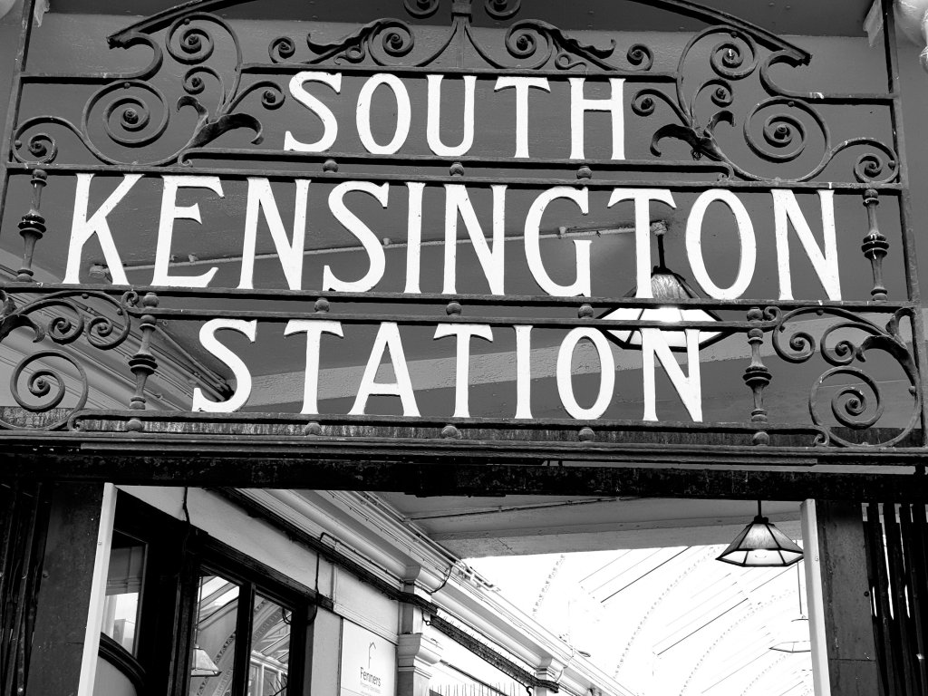
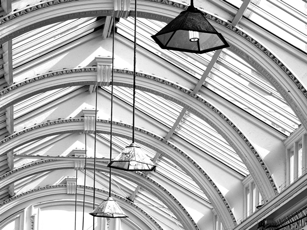
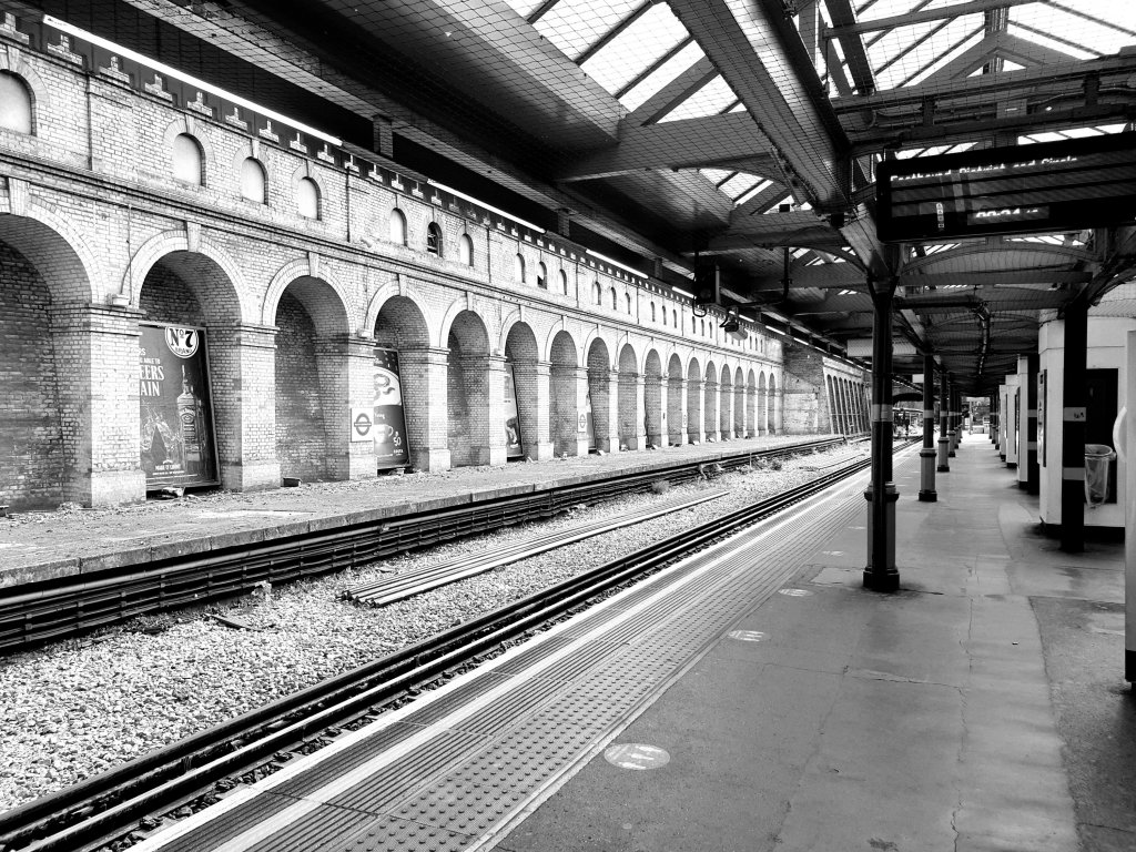
South Kensington Station (2)

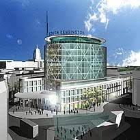
I thought it would be interesting to look up the various schemes which have been put forward for the redevelopment of South Kensington Station in the past.

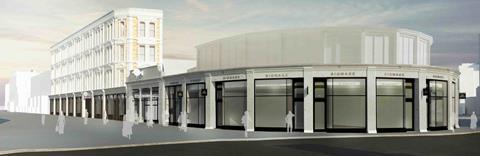
There was a scheme by Terry Farrell (1997):-

Then one by John McAslan, but I can’t find an image of it.

Then a counter-proposal by Craig Hamilton:-

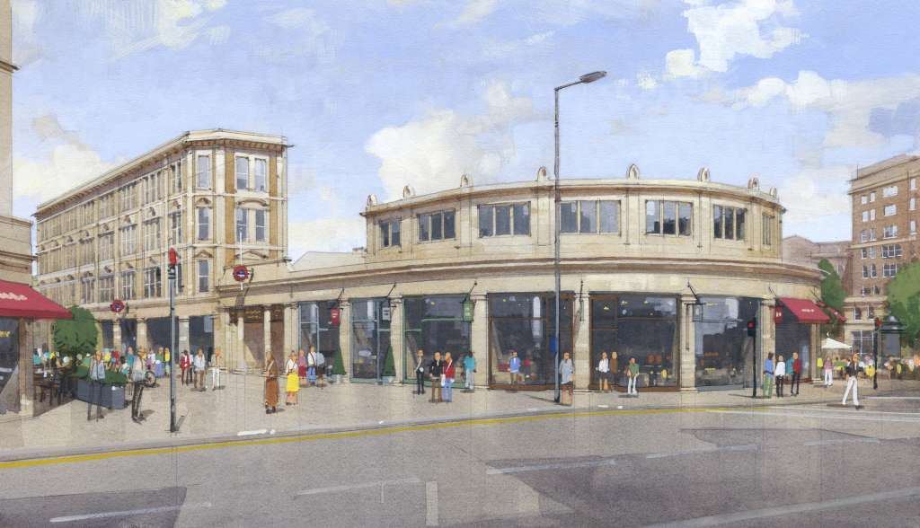
An impression of how a scheme based TfL's 2016 Brief could look (C Draper)

Then, Buckley Gray Yeoman produced a scheme, which looks like an adaptation of the Craig Hamilton scheme:-

Buckley Gray Yeoman - plans for South Kensington Tube station - Thurloe Street, arcade and bullnose

Then, Native Land chose Rogers Stirk Harbour:-

Plans submitted for South Kensington tube redevelopment | New Civil Engineer
Standard

Nuno

We were tipped off about the exhibition of the work of Nuno in the basement of Japan House. It comes from the Centre for Heritage, Arts and Textile in Hong Kong. When I see it, I am struck by the different way that the Japanese value traditional ways of making from the way we now do (according to Duncan Wilson in a letter I missed to the Daily Telegraph on May 22, a brand new burger bar is an exciting replacement for a five-centuries old Bell foundry, to be cheered on by Historic England). In Japan, on they other hand, they value traditional skills of making – to be treasured, but also to be developed, not kept in aspic as ‘heritage’. A living tradition using big machines and new technology as well as careful control of hand and eye, all demonstrated on the beautiful accompanying films of the work being done in their textile mills.

Standard

Unearthed: Photography’s Roots

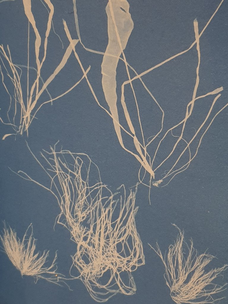
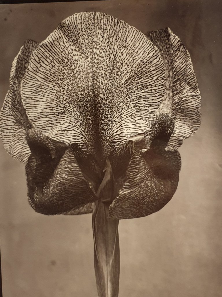
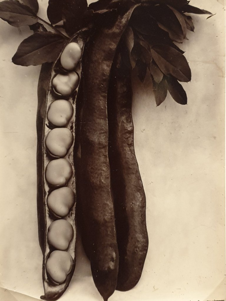
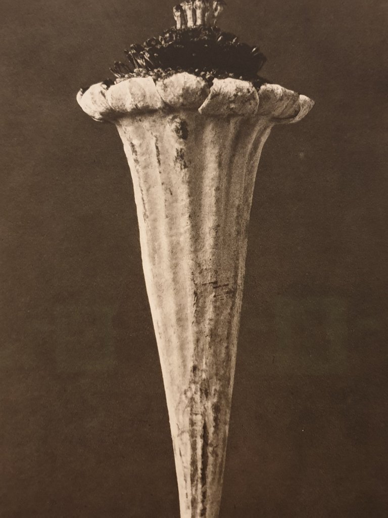
We went yesterday to the exhibition at Dulwich Picture Gallery of early botanical photography – a spectacularly interesting exploration of photography’s fascination for plant form.

Including Anna Atkins British Algae:-

Cecilia Glaisher’s Maidenhair Speenwort Fern:-

Charles Jones’s Iris Susiana:-

Jones’s Bean:-

Karl Blossfeldt:-

I strongly recommend it.

Standard

South Kensington Station (1)

One of the consequences of being involved in the debate over the fate of the Whitechapel Bell Foundry is that I pay more attention to planning battles across London, of which there seem to be so many.

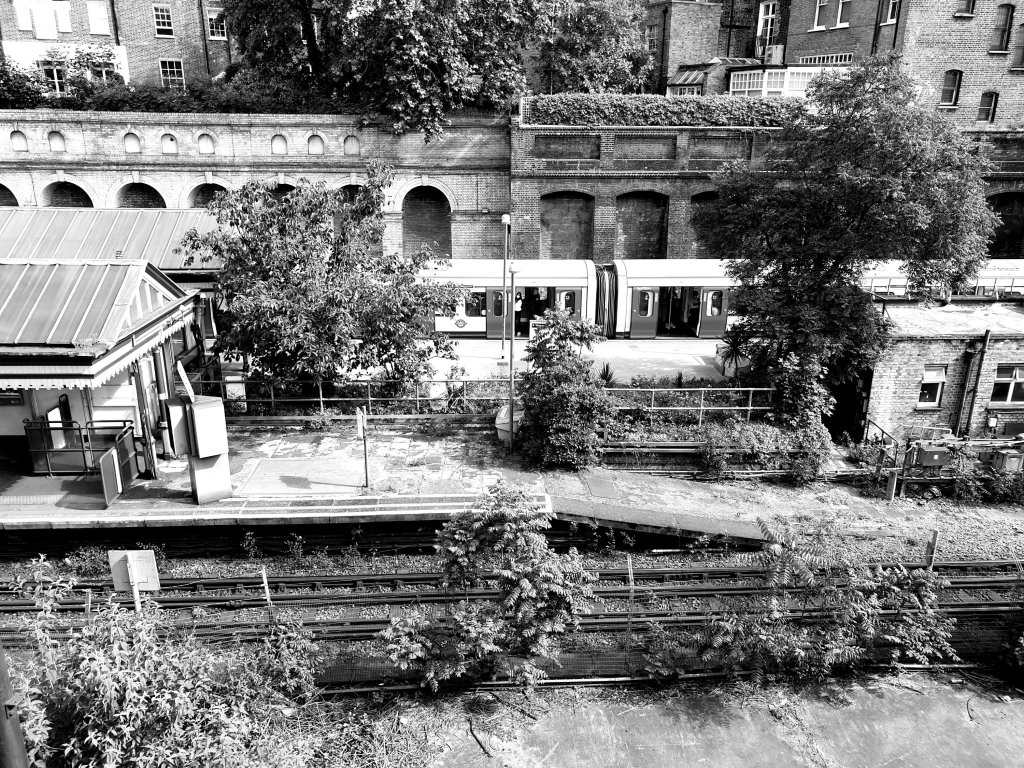
The most recent has been over the future of South Kensington Station. Whereas most of us probably regard South Kensington station as an attractively open gateway to the South Kensington museums – faintly rustic in character with flowerbeds on the platform, as if recalling the market gardens which were there before the museums and relatively unusual in being open to the skies (opened 1868) – Transport for London have long regarded it as being ripe for development where their air rights can be developed for maximum profit, regardless of the low-rise stucco housing round about populated by merchant bankers. Rogers Stirk Harbour came up with an ungainly set of plans leaving the tube arcade, but surrounding it with a circular gasometer tower block.

Unusually, Native Land has sensibly withdrawn its plans, presumably realising the strength of local feeling against the proposals. Who will it employ, one wonders, to draw up more sensitive proposals ?

Standard

Pavel Kolesnikov

We went back to the Wigmore Hall for the first time for many moons to hear Pavel Kolesnikov play Mozart and Chopin. I had deluded myself that listening to music on Spotify was an adequate substitute for the real thing – better at least than looking at digital images of pictures online – but I was quite wrong: most of all in the quality of sound for which a recording is ultimately a nearly, but not totally pure substitute; and the sense of performance – the languid way he played Mozart, the fortissimo of the final Chopin, even the occasional coughing towards the end was faintly reassuring that the normality of real experience is coming back again.

Standard

Collection History

I have been impressed by an answer by Benedicte Savoy to a question from Donatien Grau, ‘Doesn’t this idea of a museum forever holding up a mirror to itself risk calling into question the immediacy of experience of a work of art ?’

Savoy replies, ‘The collection history needn’t necessarily assume a dominant role, but it should be integrated into the experience of the whole. It won’t negate the visitor’s experience before the object, but without it the museum is depriving itself of a particular dimension. I don’t see why aesthetic emotion should have to be separated from historical emotion, from an understanding of the historical plinth on which we rest, in Europe for example. The museum needs to accept that it should show its wrinkles. You see a face, and if that face is all artificial intelligence inside a rubber mask, then it’s highly abstract. What I’m talking about is the opposite of a rejection of emotion; it’s a recognition of the quality of lived experience, the lived experience of the museums, the lived experience of the institutions, which are like the lived experience of a person…Many still clam up on this history, but it’s not a taboo subject’ (Grau 2021, p.177).

Standard