The Private Life of the Royal Academy

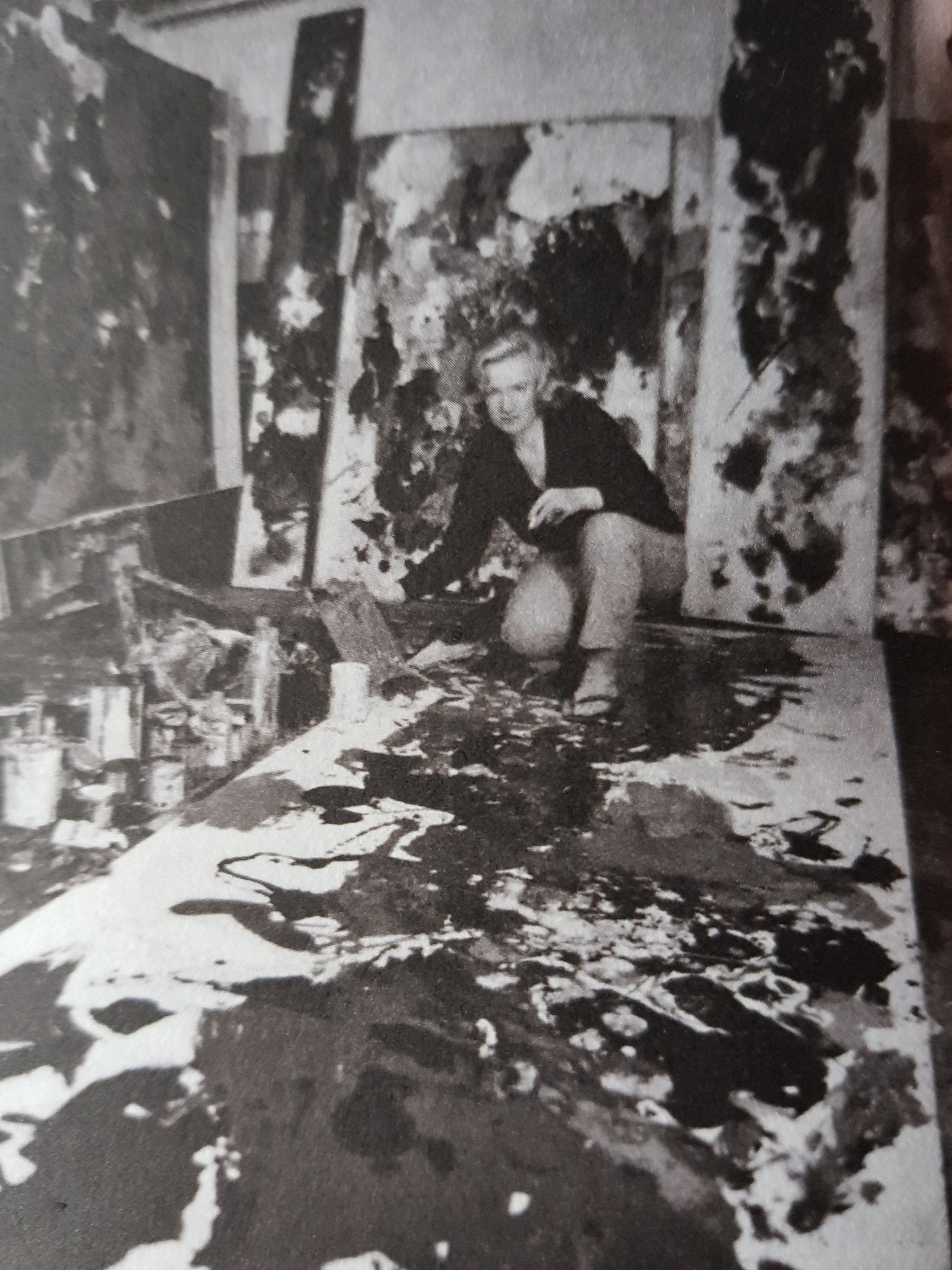
We had a private screening last night of a film which Adam Low and Martin Rosenbaum of Lonestar Productions have made called The Private Life of the Royal Academy.   They have been following what the public doesn’t see for the last five years:  the meetings, the rituals, discussions and life behind closed doors.   These fly-on-the-wall documentaries have a history which has not always been happy for their subjects:  Molly Dineen’s The Ark (1993) ends with the Chief Executive leaving;  and I don’t think The House (1995) was beneficial for the Royal Opera House or the arts as a whole.   But the mood last night felt wry, occasionally ironic, and generally benign.   Olwyn Bowey RA is the star.   It is expected to go out on BBC2 on Saturday 12 May.

image

Standard

Sebald and Book Design

I published my post on Michael Mitchell before I had discovered that there is, of course, more information than I had initially found online on Sebald’s attitude to book design and typography, in particular an article by Robin Kinross in his volume of essays Unjustified Texts, which compares the Harvill editions unfavourably with the original German editions, published by Die Andere Bibliothek.   But given the personality and temperament of both Sebald, who was deeply interested in typography and the layout of books, and Mitchell, who had such a good, if, like Sebald, somewhat old-fashioned view of typography, not to mention Bill Swainson, Sebald’s Harvill editor, I find it hard to imagine that Mitchell did not bring his characteristic sensitivity to the layout of type to Sebald’s first English publications.

Standard

Adam and Eve

We went to a wedding yesterday in St. James’s, Piccadilly.   My eye was caught by the carving on the amazing late seventeenth-century font, attributed to Grinling Gibbons, but without, so far as I can find, documentary evidence, other than an inscription by George Vertue on its engraving:-

image

image

Standard

Michael Mitchell

I learned last week that Michael Mitchell, the great printer, typographer and book designer, had died in November 2017, without my having known. I greatly admired him. We got to know him in the early 1990s when he was still working as a dentist in Newbury, but had begun to produce books on a press in the front room in his house on the north side of the Green in Marlborough. He produced an annual catalogue, copies of which are available on Abe, and I see from Abe that he produced poems selected by Christopher Logue in 1984 and an essay on Cats by L.P. Hartley in 1986, illustrated by Richard Shirley-Smith, who had taught art at Marlborough and gave Mitchell his first Albion Press. We bought a copy of Portable Pleasures by Margot Coatts, illustrated by Ian Beck, which he published in 1992. I first used him as a printer to design and print THE RESEARCH POLICY OF THE VICTORIA AND ALBERT MUSEUM, which was published in 1993 and exists in two editions, the first of which lacks Alan Fletcher’s then new logo, which I was reprimanded for not using. It’s a beautiful piece of intelligent typography, which helped give the pamphlet authority. I used him more when I went to the National Gallery. He printed David Cannadine’s 2002 Linbury Lecture on Kenneth Clark: From National Gallery to National Icon (the then new logo of the National Gallery included) and my own essay on the Mond Bequest. By this time, he had teamed up with Christopher MacLehose and had become at least as much a book designer as printer, working on the design of books for the Harvill Press, including W.G. Sebald’s The Emigrants and The Rings of Saturn. I think, but have been unable to verify it – in spite of the huge literature about Sebald – that Mitchell’s typographic style is evident in the layout and visual qualities of Sebald’s books, which, if true, would give Mitchell, alongside Sebald, a form of immortality.

Standard

Whitechapel Road

You’ve seen it all before, if only in the book, but not necessarily in such beautiful weather.

The trees which line the A12:-

image

Trinity Almshouses:-

image

image

The Blind Beggar, named after Henry de Montfort who died in the Battle of Evesham in 1265 and ended his days begging in Bethnal Green:-

image

David Adjaye’s Idea Store:-

image

The fountain outside the tube station:-

image

image

And the old Grave Maurice public house, whose name commemorates Prince Maurice of the Palatinate, who fought for the royalists in the Civil War, rebuilt in the early 1870s by Robert Mann of Kentish Town, and frequented, like the Blind Beggar, by the Kray Twins:-

image

Standard

Grand Designs

The first bit of press has appeared in the Daily Telegraph colour supplement this morning for our new building development under the title ‘Grand Designs’ (it was already online yesterday on https://www.telegraph.co.uk/art/artists/royal-academy-250-inside-sir-david-chipperfields-new-56-million/).   It seems quite fair, at least to me.   It is impossible to escape the myth of dysfunctionality, ‘the Naples of the art world’.   Is it ‘the establishment’ or not the establishment ?   The article makes clear that it’s both.

Standard

David Chipperfield RA

I went to David Chipperfield’s offices last night to attend the launch of the latest book about his practice: they get fatter each time, but always in the same deliberately economical typeface, designed by John Morgan. This time there is an introduction by Fulvio Irace, a Professor at the Politecnico di Milano, which places Chipperfield’s work in the context of the postwar Milanese tradition of pragmatic rationalism: Aldo Rossi, obviously, with his interests in the city and classicism; Ernesto Rogers less obviously; and Carlo Scarpa, who clearly influenced Chipperfield’s interests in the fragment, in history, and in the relationship between survival and new build. What comes across is his interest in the layering of history in his projects – that he is working in a continuum, in contrast to many of his contemporaries, who regard building as a clean sheet. As he stated in a conversation with Peter St. John and Adam Caruso in 1997, ‘I’m not obsessed with the idea of a clean sheet. I think we are in a continuum and that our responsibility is to find clues in memory and context’. I find this helpful in thinking about what he has achieved in Burlington Gardens. It’s a combination of attentiveness to the quality and characteristics of the original building with an intellectual boldness in the insertion of new elements.

Standard

The View from Waterloo

It’s about three years since I last went to the Chipperfield offices in a high rise (but not very high) overlooking Waterloo.   I remember Chipperfield looking out over the urban morass and lamenting the lack of any systematic town planning, while I slightly relished the view of nineteenth-century streetscape.   In the intervening time, the view has been comprehensively buggered by the horrible building south of London Bridge.   How on earth did it ever get planning permission ?

image

On the other side is Grimshaw’s sinuous Waterloo station, majestic, but still unused:-

image

And to the north is Qatar’s latest London development:-

image

Standard

Arthur Lett-Haines

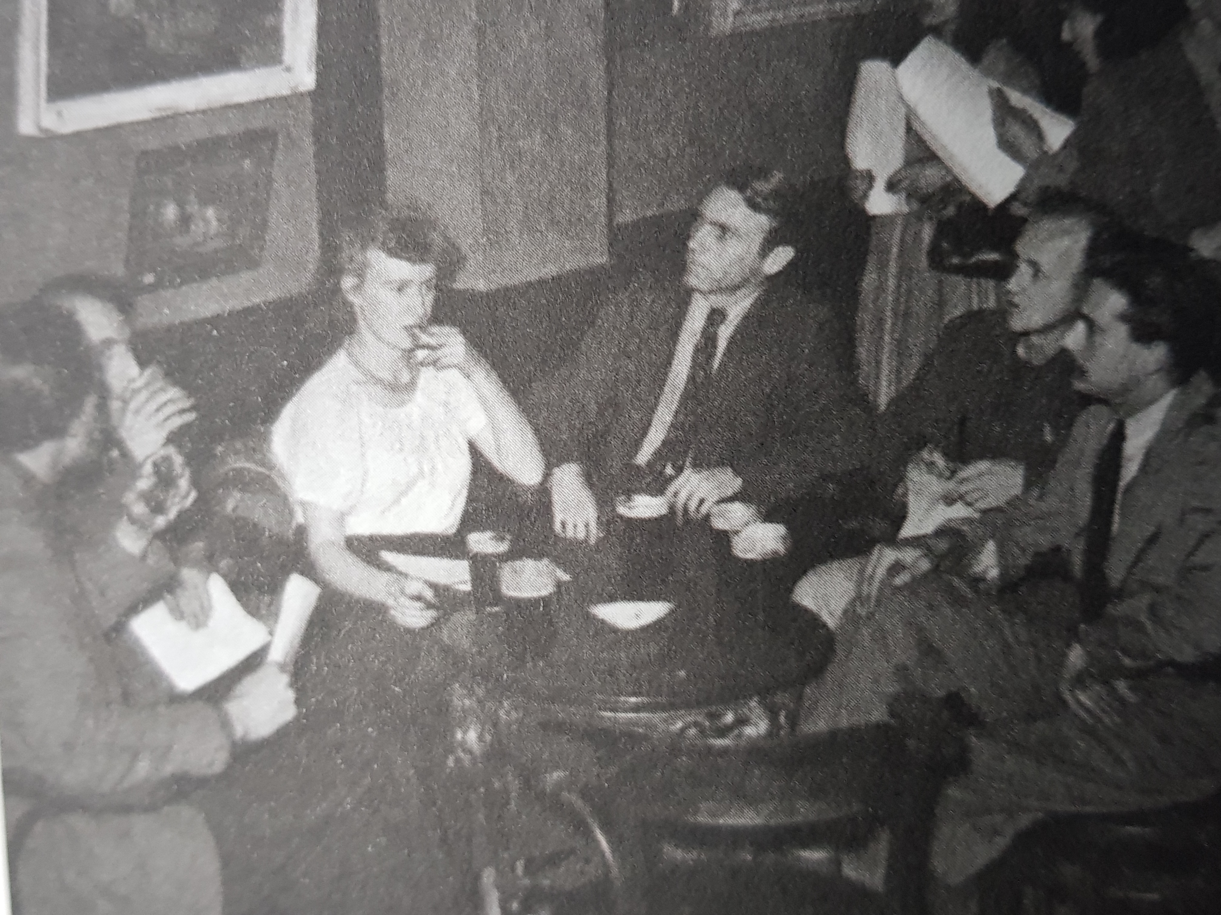
In rootling about for information about Arthur Lett-Haines (Lett as he was known), I was intrigued to discover Richard Morphet’s description of his relationship with Cedric Morris in the DNB:  ‘Morris was quiet, humorous, impractical, country-loving, and determined to concentrate on his art (with its key activity of human observation) and on the world of plants and animals.   Lett-Haines was complex and sophisticated, a natural organizer, and dedicated to expanding recognition of Morris’s art’.   When Kathleen Hale, of Orlando the Marmalade Cat, was told by her psychoanalyst in the late 1930s that she needed to have an extra-marital affair to unblock her art, Lett obliged.

Standard