Eric Gill:  The Body

Alongside the display of Cathie Pilkington’s work is a small, but intellectually challenging display of objects which deal with the explicit, or sublimated eroticism of much of Gill’s work and how it should be regarded following the publication of Fiona MacCarthy’s biography of Gill in 1989 with its revelations of the scale of Gill’s predatory sexual practices and abuse, not least of two of his daughters.   In 1989, the biography caused a stir, but looking back at it now, it is concerned with creating a more complex view of Gill and his work.   The exhibition confronts the issue more directly as to whether or not one’s view of an artist’s work should be influenced by knowledge of their life.

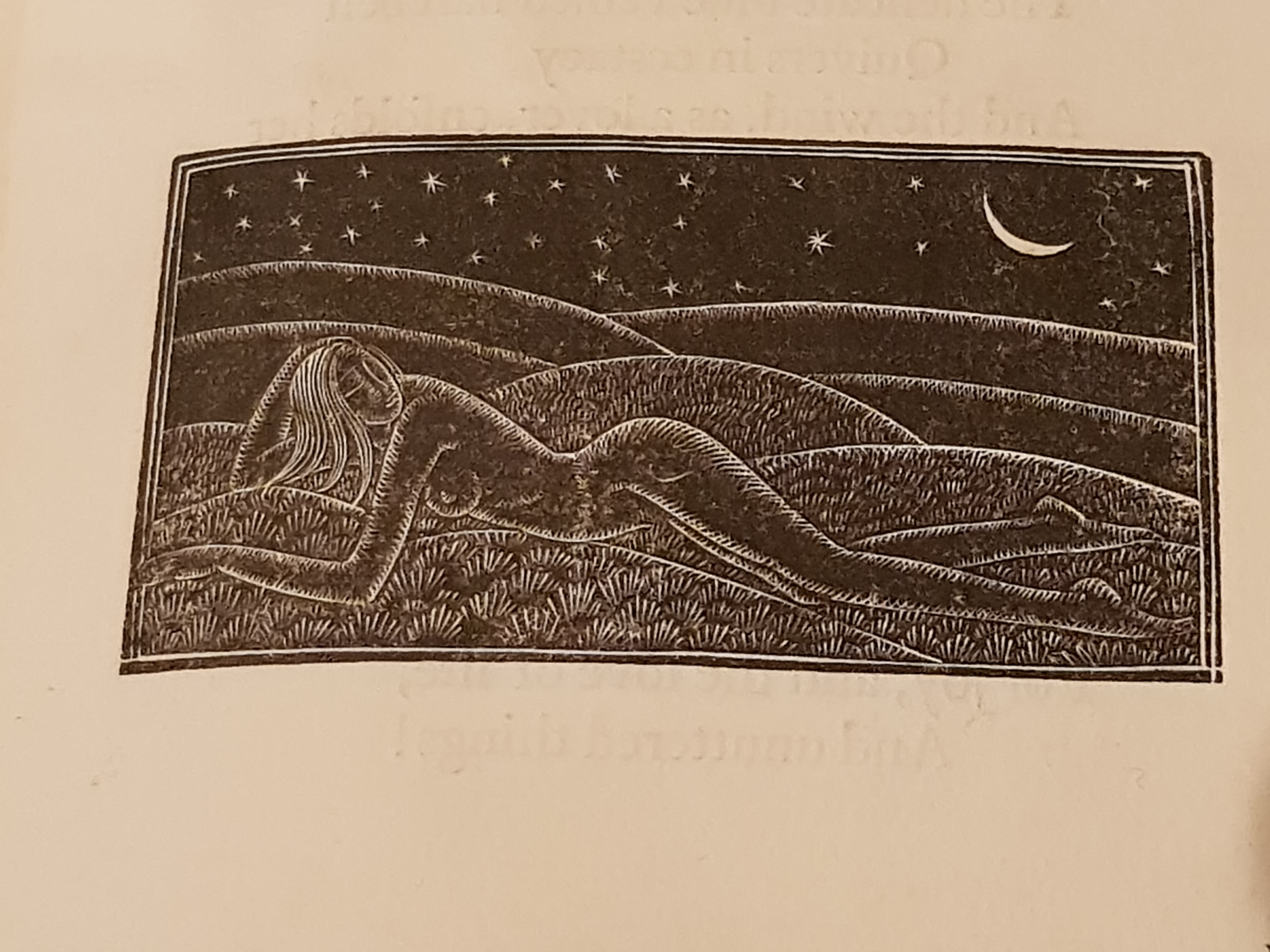
This is an illustration (relatively anodyne) from Sonnets and Verses:-

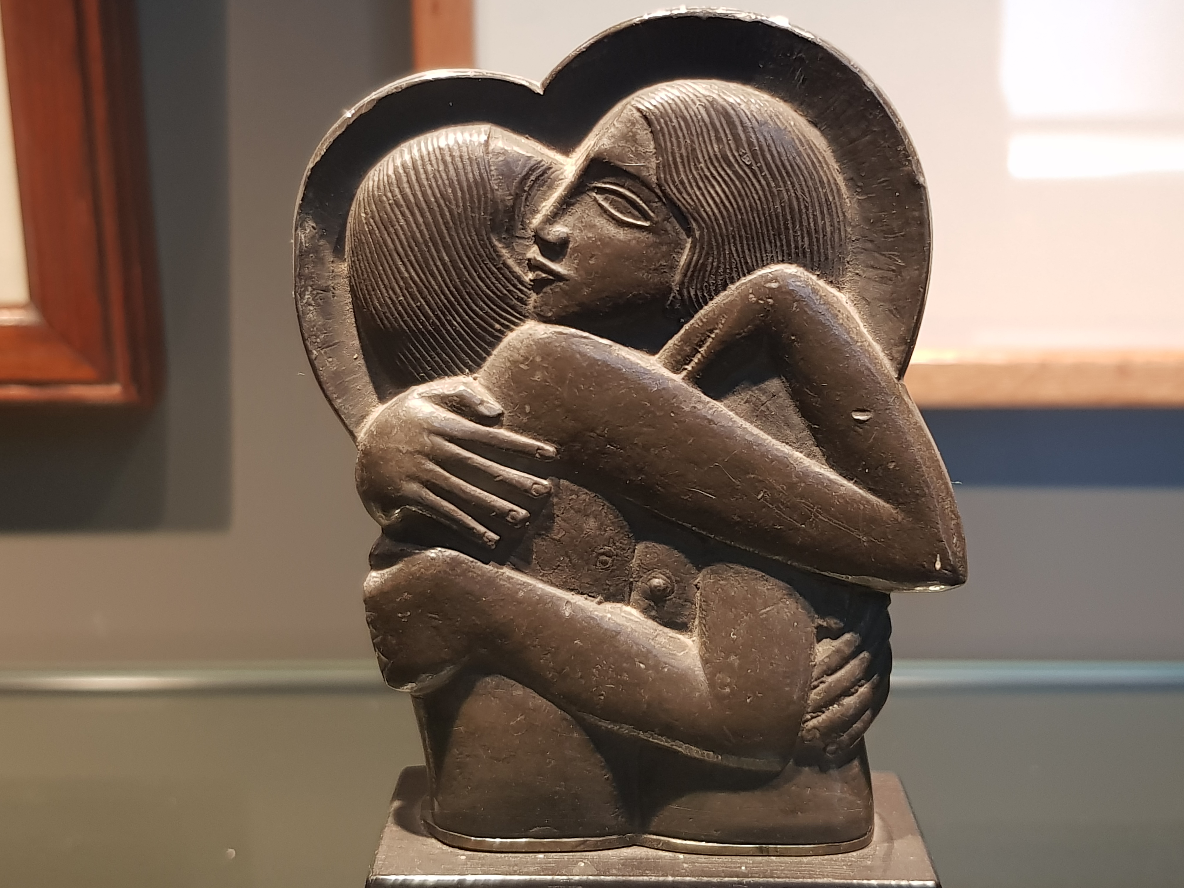
This is a cast from a wood-engraving called Divine Lovers (it’s in a section forbidden to unaccompanied minors):-

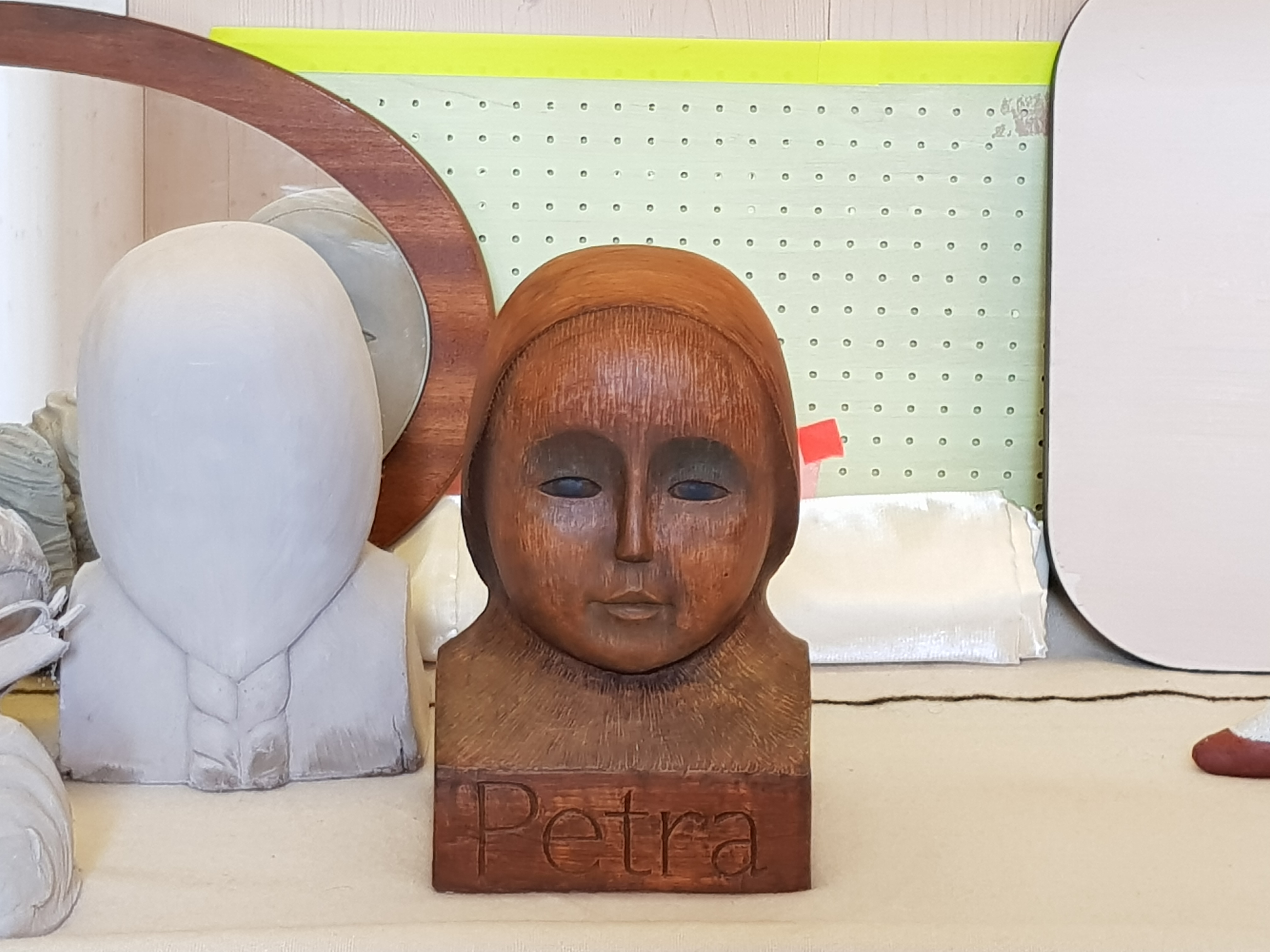
This is a Doll’s Head, thought to be by David Jones:-

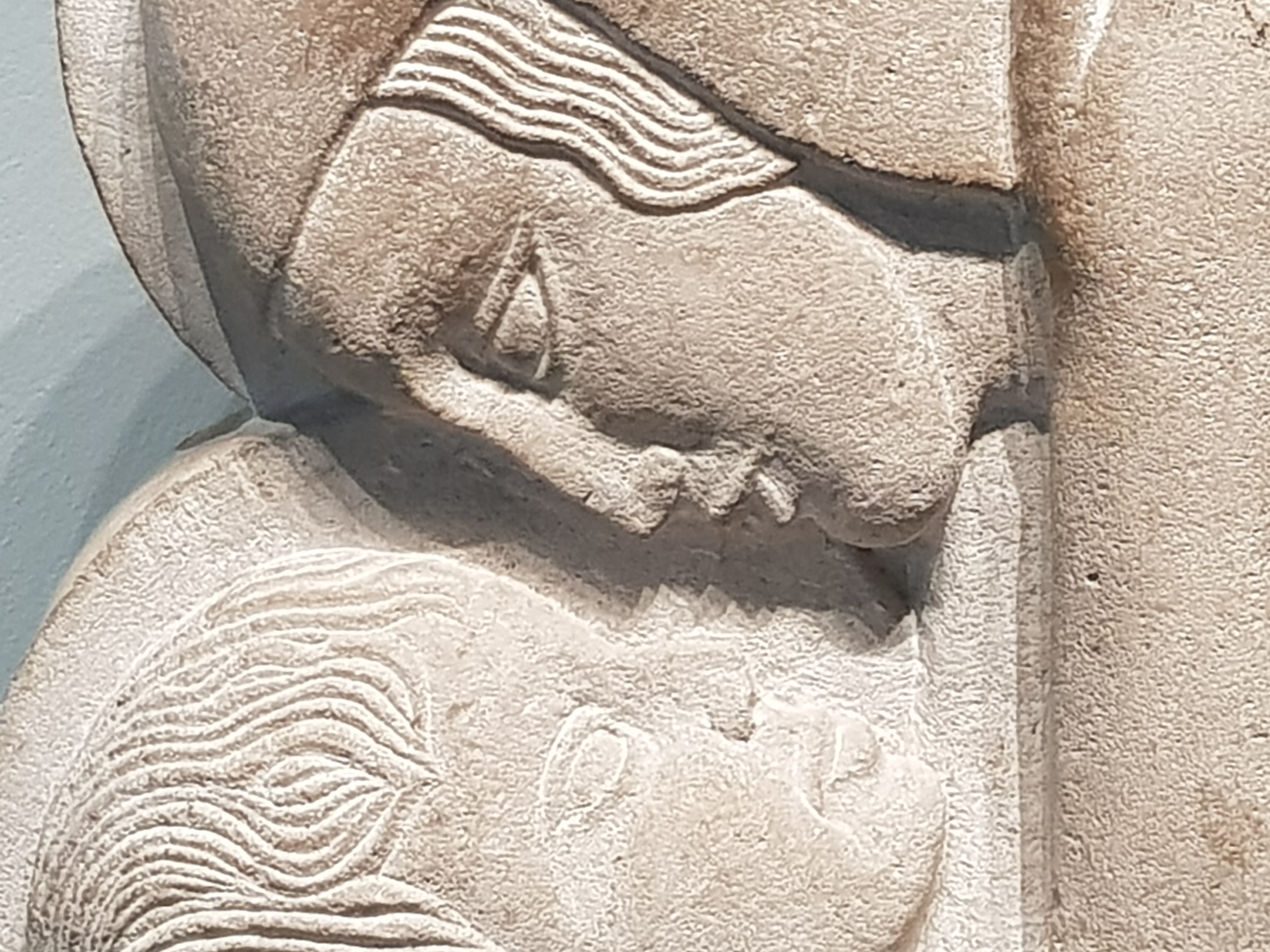
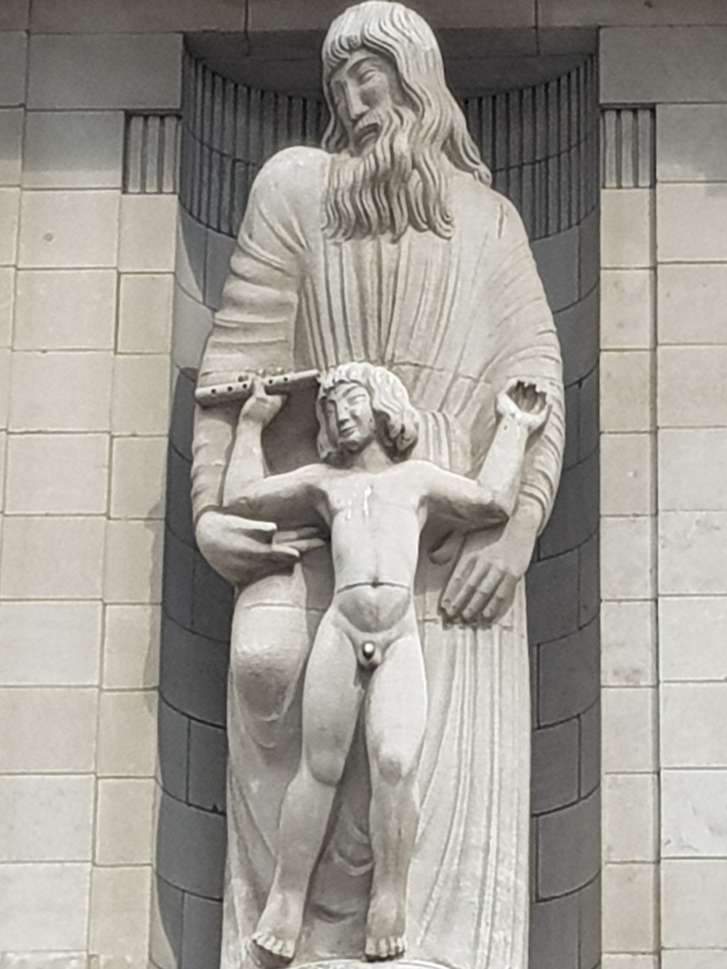
And Joseph Cribb’s Madonna and the Christ Child, 1927:-

Standard

Doll for Petra

About a year ago – it must have been in June – we called in at the Ditchling Museum en route to Charleston, but too briefly to get a proper sense of the highly intelligent new building by Adam Richards and the wealth of the collection.   So, I was really pleased to be asked to the opening of Cathie Pilkington’s installation Doll for Petra which is a way of commenting on, and interpreting, the small wooden doll which Eric Gill made for his daughter, Petra, in 1910, when she was four, in relation to the fact that, as the label baldly states, ‘over a decade later, he sexually abused her’.   Pilkington’s own work is ideally well suited to this task, being figural, but also surreal and, unlike much contemporary art, sexually charged.

This is the Gill doll:-

And these are the dolls done by Cathie in response:-

Standard

Alan Johnston

En route to the BBC, I happened to walk past the entrance to a small contemporary art gallery, Bartha Contemporary, in Margaret Street.   It looked interesting, and turned out to be about to open an exhibition of the work of Alan Johnston, a Scottish minimalist, whose very delicate and refined drawings I have barely seen since the mid-1970s (he was represented by Nigel Greenwood), except in the drawings he has done in the spandrels of the downstairs café at Tate Britain, commissioned by Penelope Curtis:-

Standard

Broadcasting House

I went to the unveiling of a plaque commemorating Sir Richard MacCormac’s contribution to the design of the new Broadcasting House in Portland Place.   I thought there would be no mention of the fact that Richard’s last years were blighted by what he thought was his unceremonious sacking from the project in 2005, but, on the contrary, each of the speakers referred to it and it became clear that the event was, to some extent at least, an act of posthumous reparation, in recognition of the fact that, having won the public competition chaired by Sir Christopher Bland, he contributed its two key features:  an outsize, underground newsroom which was not part of the original brief, and the open precint dominated by Nash’s All Soul’s, Langham Place.   The only problem with the event was that having heard the speeches, we couldn’t find the plaque.

Prospero and Ariel over the entrance by Eric Gill:-

And MacCormac’s precinct:-

Standard

Trajan

I was interested to find out more about the typeface Trajan, as used by Oliver Hoare and his designer, Charles Marsden-Smedley, as the font for his exhibition.   The answer is that it’s a modern font, one of a number of modern, but classical typefaces devised by Carol Twombly in the late 1980s for Adobe when digital typography first came in:  based, as one might guess from the name, on the stone lettering on the base of Trajan’s column.   It was a style of lettering which was apparently much admired in 1950s Russia when there was a revival of interest in traditions of typographic design.

Standard

Every Object Tells a Story

I snuck off from the opening of the London Original Print Fair – interesting and enjoyable as it was – in order to see Oliver Hoare’s latest cornucopia of objects which he is displaying in what was John Lavery’s studio in an upstairs room in Cromwell Place, soon to be transformed into a so-called arts quarter.

Not least, I admired the typography of the invitation (or was it the advertisement in the Burlington Magazine ?), designed by Charles Marsden-Smedley and using a typeface called Trajan, which is apparently seldom used because of the cost of obtaining a licence to use it.   This is the bag:-

I don’t know where he finds the objects – I assume from all over the world and brought to him to inspect by ancient traders.   Often, they were once ordinary, but have been given an aura by the company they keep in display cases which are cabinets of curiosities:-

Standard

Hatchard’s (2)

I’ve just done a conversation in Hatchard’s with Dan Cruickshank and a small, but very knowledgeable audience who asked interesting questions.   One of them was about the inhabitants of East London who are conspicuous by their absence from the book;  the answer, which is only half true, is that I’ve never been good at photographing moving subjects (it’s an architectural book).   A second was why Hoxton is so poorly represented;  the answer is that I never set out to be topographically systematic in my coverage.   Dagenham is missing as well.   A third was what I think of Canary Wharf;  the truth is that I am an admirer of Canary Wharf, which has been a very successful agent of regeneration and which, as readers of my blog will know, I admire architecturally.   The only unanswerable question is what is happening at the Whitechapel Bell Foundry.  

Standard

The book of the blog (3)

I realise that the blog is suffering from an overdose of self-advertisement, but for those people who can’t pick up a copy of today’s Evening Standard (the first with George Osborne as editor), there is a long-ish interview in a section called Lifestyle in which the style of the blog is described – no doubt accurately – as ‘a mix of patrician and endearing self-deprecation’.   It’s at http://www.standard.co.uk/lifestyle/books/charles-saumarez-smith-on-his-new-book-and-being-an-east-london-gentrifier-a3528196.html.

Standard

Hatchard’s (1)

I’ve been geering up for a talk I’m doing at Hatchard’s tomorrow with Dan Cruickshank (tickets are apparently still available) by reading up about Hatchard’s history.   It was apparently founded in 1797 by John Hatchard, originally at 173, Piccadilly, then moving in 1801 to 189-190, and to no. 187 where it is now in 1810.   Hatchard himself had been apprenticed to a ‘Mr. Ginger’, a bookseller and publisher based in Great College Street, Westminster, before moving on to work for another bookseller, Thomas Payne, in Castle Street, St. Martin’s   He himself described in an autobiographical fragment how ‘I quitted the service of Mr. Thomas Payne 30th of June 1797, and commenced business for myself at No. 173 Piccadilly, where, thank God, things went on very well, till, my friends desiring me to take a larger shop, I then did so, I think June 1801, at No. 190 in the same street’.   Hatchard, as one might guess from this account, was an evangelical and a tory.   His bookshop was by no means alone in this part of Piccadilly:  Debrett was at no. 178 (the numbering system is complicated);  John Stockdale was at no. 181 on the corner of Duke Street;  John Wright was at no.169, supplying books to members of Pitt’s government before going bust in 1802.   The smart set went to their clubs in St. James’s and picked up a book en route, as some still do today.

Standard

Newfoundland

It is the opening today of Romilly’s exhibition Newfoundland (or Y Tir Newydd in Welsh) at Ruthin Craft Centre in the borderlands of Wales.   A version of her exhibition which was shown at the Sainsbury Centre, it shows the work she has done based on the recovery of bits of either Roman or medieval ephemera – buckles and clasps and badges – re-invented/re-established as highly inventive modern craft objects, rich in the resonance of recreation.   Alongside the exhibition, as well as a series of interpretative photographs by Verdi Yahooda, there is a monitor showing the short, very beautiful film, Amanuensis, which has been made about her work by Maria Nicholson and which is going to be shown on Thursday at Picturehouse Central as part of London Craft Week (www.romillysaumarezsmith.com/film).   I strongly recommend it:-

Standard