
Following a seminar last night organised by the Paul Mellon Centre to introduce the new heavily revised third edition of Pevsner’s Wiltshire, I was so pleased that my copy arrived today, so that I was able to check out some of the entries while it was fresh in my mind. It gives a date, 1881, for the Old Vicarage, Redlynch, the house where I was born. It states more definitively than I had known that the Mound at Marlborough is not simply a Norman motte as had been thought, but has been proved by carbon-dating to be contemporary with Silbury and, in addition, that the lining of the grotto added in its base by Lady Hertford was restored by Diana Reynell, the wife of the classics master, in 1986. It describes the Great Barn in Tisbury as being earlier than previously thought, tree-ring dating giving a date of 1289-1314 (can it really be so precise ?). It gives a date, 1740, for Oare House and a scrupulous description of the Pavilion designed by I.M Pei. The quality of photography is also hugely much improved, with a very atmospheric photograph of the Stone Circle at Avebury and good photography, always difficult, of tombs. It reveals that Henry Dawkins, the owner of Trafalgar House, was a Jamaican plantation owner, but not, so far as I can see, Alderman Beckford. Altogether, it looks like a pretty mighty achievement of radical research and rewriting by Julian Orbach, taking six years, when Pevsner pumped the original volumes out over his summer holidays.
Category Archives: Uncategorized
63-81, Pelham Street
Following my recent trip to South Kensington to study the likely impact of the planned development of the underground station, I have been alerted to the plans to develop an adjacent site on Pelham Street by the Wellcome Trust, one of the UK’s biggest charities – I assume not for the benefit of the local community, but for purposes of pure profit, probably through their commercial property arm since the headquarters of the Wellcome Trust are on the Euston Road and the trustees may have been encouraged to think that the development is unproblematic.
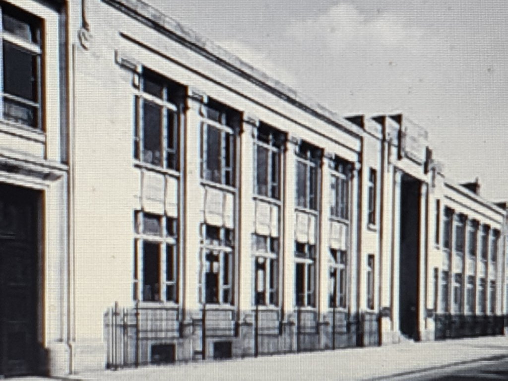
The building it will replace is not without interest, originally designed in 1924-5 for the Kensington and Knightsbridge Electric Lighting Company by C. Stanley Peach, who had a successful architectural practice based in Warwick Square (bad photograph, I know, probably taken in 1925):-
There is still the residue of this building in the architectural detailing:-
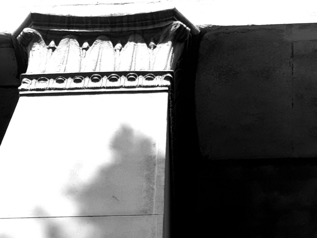

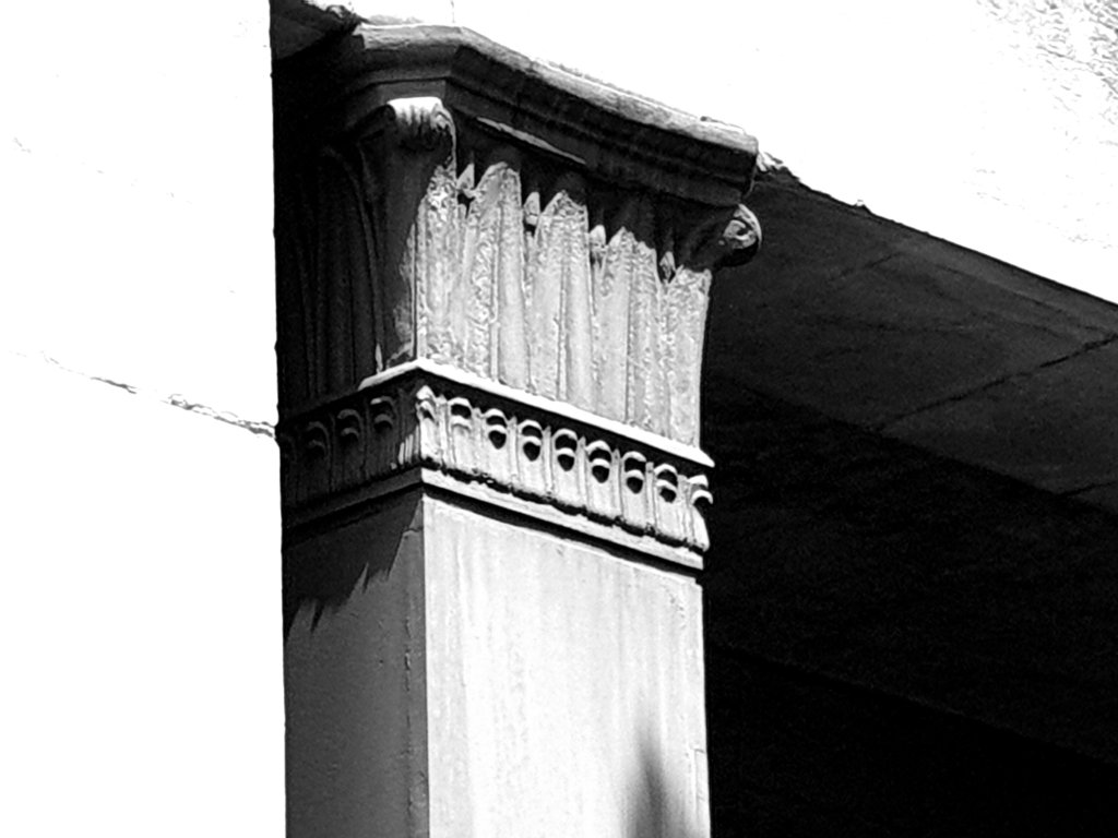
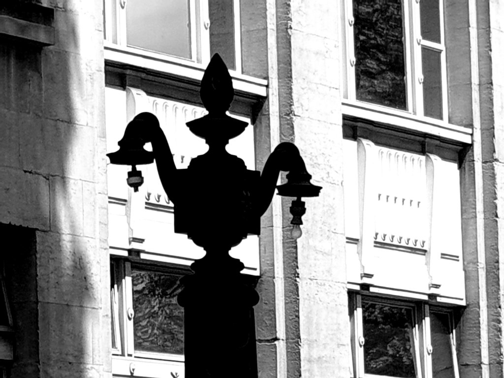

One might expect the Wellcome Trust to want to restore and reinstate the original building. But, oh no ! They plan to demolish it and put up a pretty hideous and non-descript replacement:-
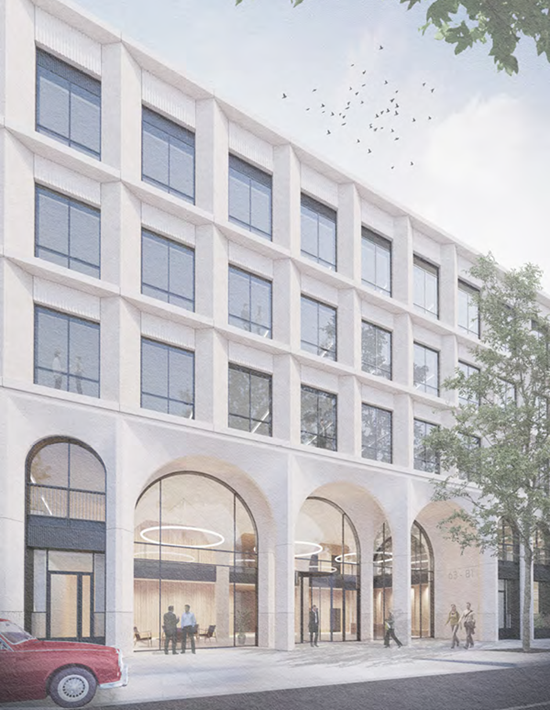
Is this really the best that the Wellcome Trust can do ?

John Wonnacott (1)
I went on the train from Limehouse to Chalkwell to see John Wonnacott’s latest work which was all lined up in his back yard:-
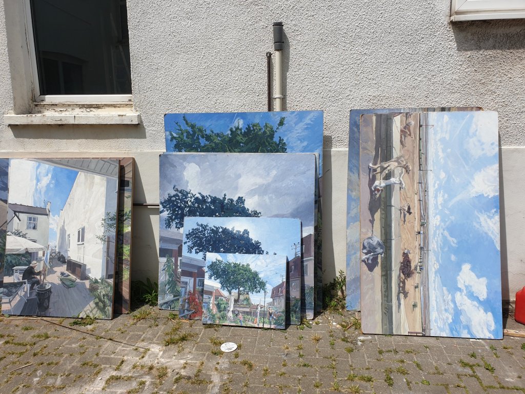
I enjoyed seeing it, particularly a small painting inspired by Giovanni Bellini:-

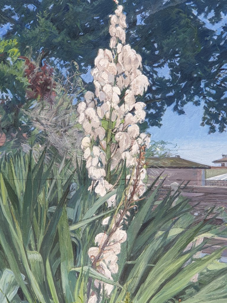
He is good at painting movement. And flowers, which I don’t associate with him:-
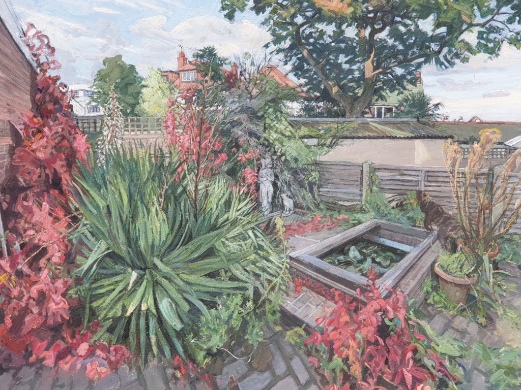
Since it is nearly the anniversary of the Grenfell Tower fire, I am also posting his fine commemorative painting post-fire:-

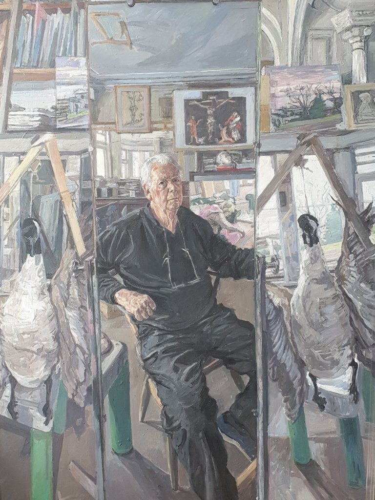
And a recent Self-Portrait:-
London’s Best Bakeries
As readers of my blog will know, I am mildly obsessed by good bread and where to buy it, partly a consequence of lockdown, which I think has made everyone focus on quality of food while restaurants have been closed and partly because I have always liked good fresh bread, almost better than anything (we had to fight for a loaf of fresh bread after lunch at school). So, I was pleased to get the latest issue of The Modern House Journal, which clearly shares this obsession (Bread Winner: London’s best bakeries | Journal | The Modern House). But it is not very strong on East London and misses out Breid, which supplies lots of local shops, and has become more and more popular over the last year, and my new favourite, Doh in Hackney Wick. They both deserve to be part of the pantheon.
Robins
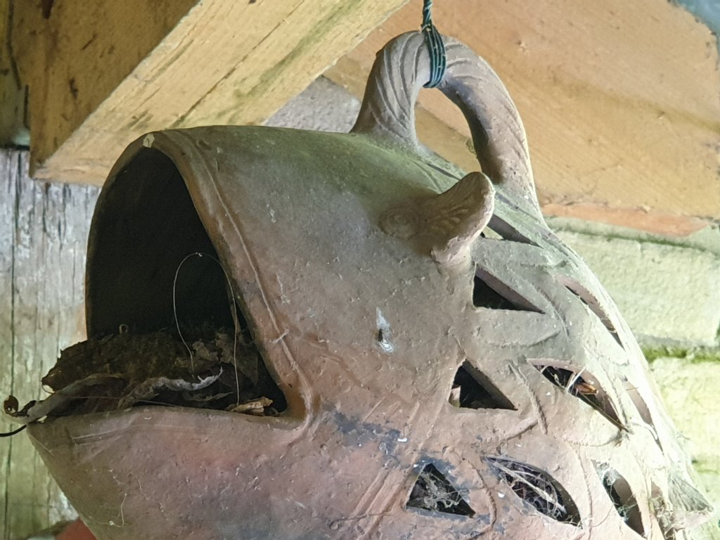
A robin has made its nest in the ceramic fish hanging under the verandah in the garden:-
Today at lunchtime, its progeny was hopping about the garden – larger and fluffier than its parent:-

Thomas Adès
We went to Thomas Adès’s 50th. birthday concert at the Barbican, starting and ending with Beethoven, with two great works by Sibelius and Janáček and two by Adès himself, one a new work based on a sea shanty and one an older work written when he was twenty-six, described by the chief violinist of the Britten Sinfonia as both disciplined and bonkers. It made me look up the picture which the NPG commissioned, when he was only thirty one, the first of a series of portraits paid for by the Jerwood Foundation to show young talent. It was rather a brilliant portrait, showing him in a buttoned-up white cotton suit, twisted up on an old leather chair with an empty wine glass by his feet. Of course, the hall was half empty because of the requirement for social distancing, but this didn’t diminish the intensity of the occasion and the sense of normal life beginning to resume, like sleepwalkers after a long intermission.
The Art Museum in Modern Times (5)
I am very honoured to have been sent a characteristically thoughtful review of my book by Svetlana Alpers, the great historian of Dutch painting, formerly of Berkeley, California, now writing about photography in New York. Of course, she is right that much is missing from the book by focusing only on the last eighty years or so, thereby missing out on the pleasures of the Grand Old Men of the international museums, including the National Gallery which she remembers, as do I, when it was a straight historical circuit, starting to the left of the entrance staircase. And I don’t dispute that it is important to encourage critical historical attention as well as more casual wandering. It will probably be seen correctly as a pre-COVID text when the mood was more optimistic. Let’s hope that some of the angst now surrounding museums dissipates, and we can recover a better sense of their role in fostering an interest in other cultures.
https://www.keyreporter.org/book-reviews/2021/the-art-museum-in-modern-times/
Typography and the Museum (2)
A couple of footnotes to the discussion on typography and museums.
- We were asked which museums do their graphic design best. Both Harry Pearce and I instinctively answered MoMA. I didn’t know, which I no doubt should have done, that the classic MoMA logotype was designed by Ivan Chermayeff in Franklin Gothic No 2 and launched in 1964, remaining fairly unchanged ever since, proof of its effectiveness. ‘The ideas that are quick, even instantaneous, are the best’, he said. ‘I sometimes have a great idea while the problem is still being described by the client. I have learned that the worst thing you can do is to put that idea forward immediately, because then it has no value’.
- I couldn’t remember who had designed the National Gallery’s logotype, which was in the process of being designed when I arrived in July 2002 and has survived pretty intact ever since. The answer, I think, is that it was done by Lee Hoddy, the then creative director of Bamber Forsyth. The font used – and which they still use – is (very appropriately) Bembo: conservative, but clear, legible and smart. We also put the definite article back, but asymetrically:-


You must be logged in to post a comment.